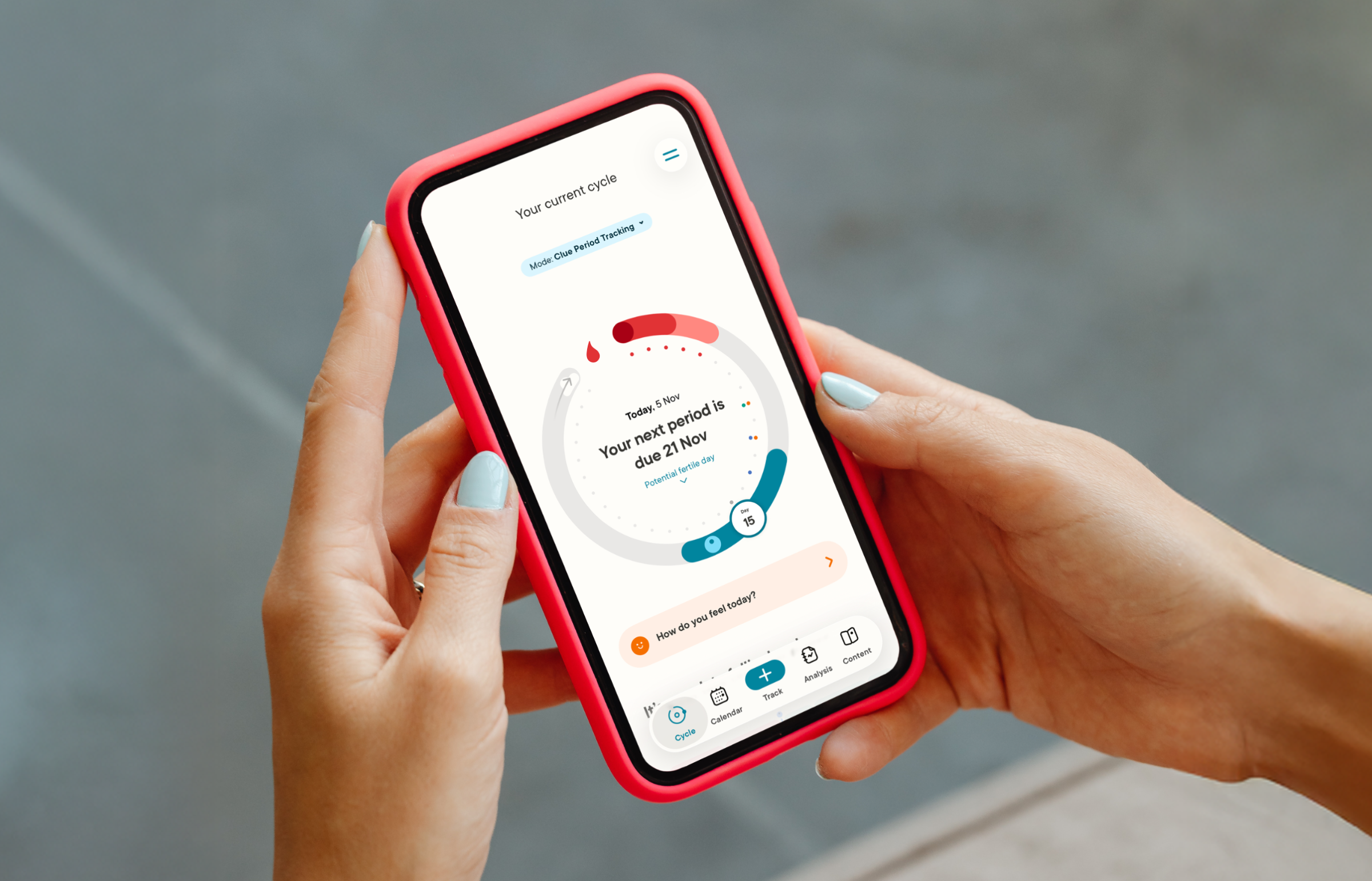
ClUE MODE SWITCHER: DriVING SUBSCRIPTION GROWTH
ROLE Senior Product Designer, Design Lead
TIMELINE November 2022 – January 2023
DOMAIN Health tech, growth
SCOPE Native apps: iOS & Android, highly critical home screen UI
IMPACT 14% of subscriptions attributed to mode picker in first weeks & buy-screen views doubled
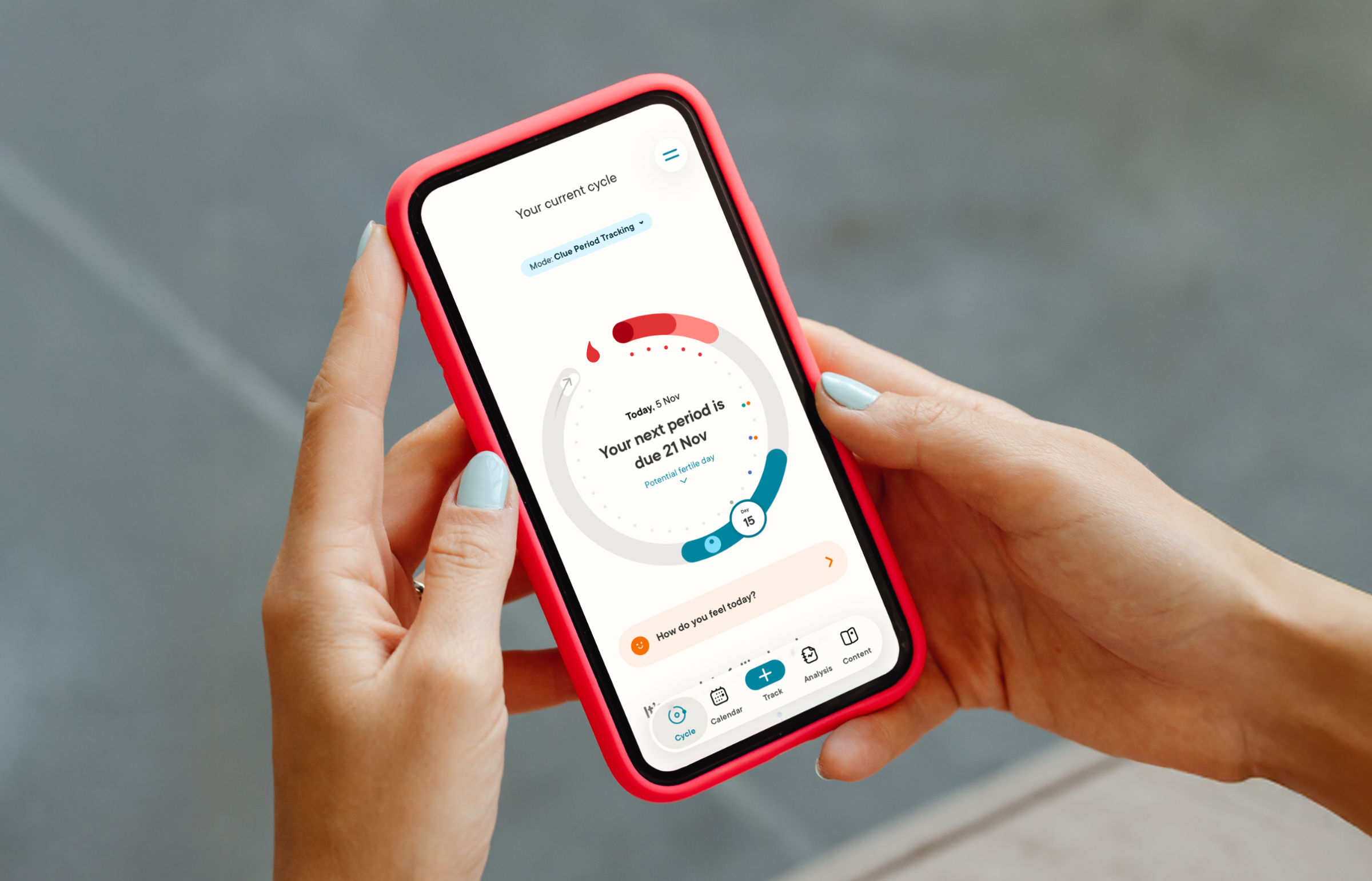
Final UI of the implementation: mode picker above the cycle.
Clue is a pioneer femtech app with 11 million users worldwide. Clue helps women and people with cycles take control of their reproductive health. During my tenure at Clue I worked on the premium products Clue Conceive and Clue Birth Control. The core team consisted of myself as product designer, the product manager and a UX researcher. Other stakeholder were engineers, science and regulatory team members.
Defining the problem & opportunity
My team at Clue was working on onboarding and growth funnel of Clue Conceive after its release. In late 2022, we started to have a hunch that instead of focusing on new users, there is still a significant amount of existing Clue users, who are actually not aware of the premium modes existing. At the time we were running exploratory early-use interviews and also surveys with users that landed on the onboarding funnel, and we were starting to learn that even with existing users, they heard about Clue Conceive from somewhere other than the app itself. This indicated that there is a significant amount of users that use the period tracking mode to help them get pregnant, instead of Clue Conceive mode, which is designed for the purpose and has a clinically tested algorithm.
Business problem:
Our paid modes are not visible enough to the exact users that are interested in them.
Problem statement:
How might we make our users more aware of the different modes within Clue app, so Clue can best support them in their reproductive health journey?
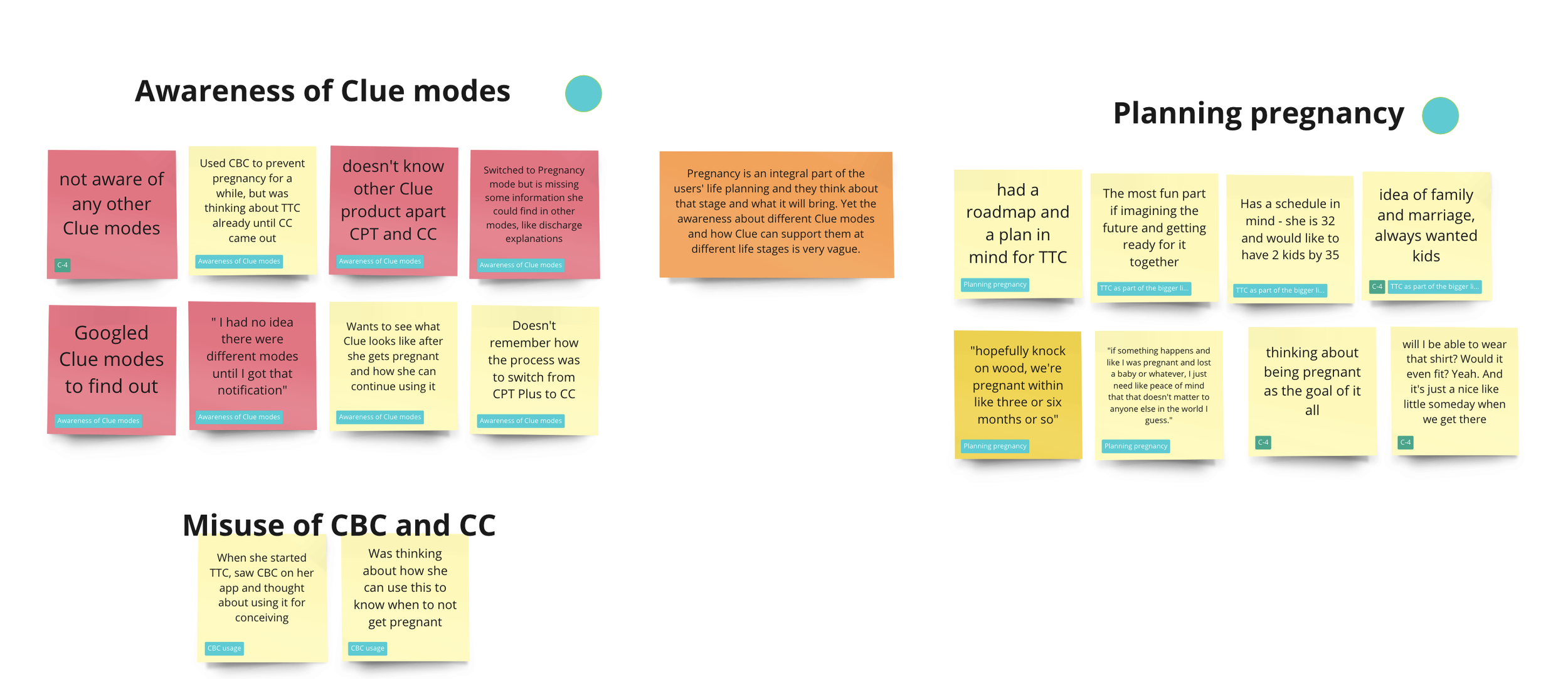
A section of post its from analysing user research - red ones are showing pain points, in this case the low awareness of modes.
Ideation & Prioritisation
My team was tasked to work on ideas that could grow revenue and be implemented fast. So the drivers for this project were increasing traffic to premium modes, fast implementation and iteration cycles and impact on revenue. We did an ideation session were these restraints were used. Some of the ideas that came from the ideation session were ranked on an impact-effort matrix and prioritised as a group effort between engineers, product manager and myself representing design. One of the ideas with most impact and fairly low implementation effort was creating a mode switcher in the cycle view, which is the home screen of the app.
The mode switcher on the cycle view screen would help users explore easily what other modes there are, and our hypothesis was that over time that would result into more people switching to the paid modes that fit their situation best. This would also fix another issue: some new users were confused about which mode they had landed on, if they chose not to subscribe in the onboarding funnel. The mode switcher would highlight the mode the user is currently in.
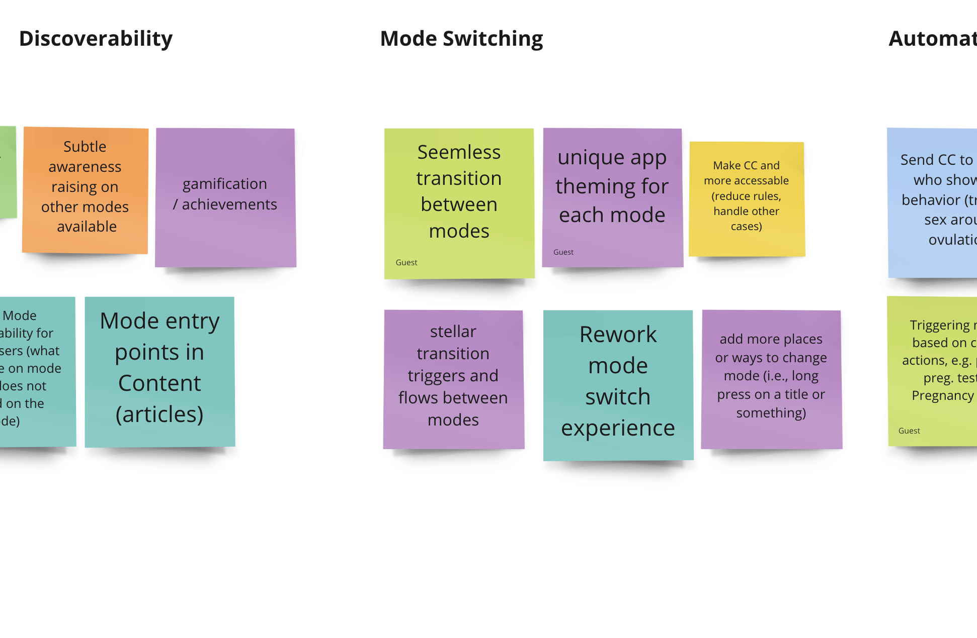
Some idea post-its
UX & UI Design
Adding a mode switcher in the cycle view of the app is something that needed to be done with much consideration, as this is the main UI that Clue is known for and users love. Because of that, I jumped directly into fairly high-fidelity designs, so we have design artefacts that can create discussion within the design team and also with engineers. Using components that exist in the design system is always preferred, but I was exploring options of creating new ones also. See some design explorations below.
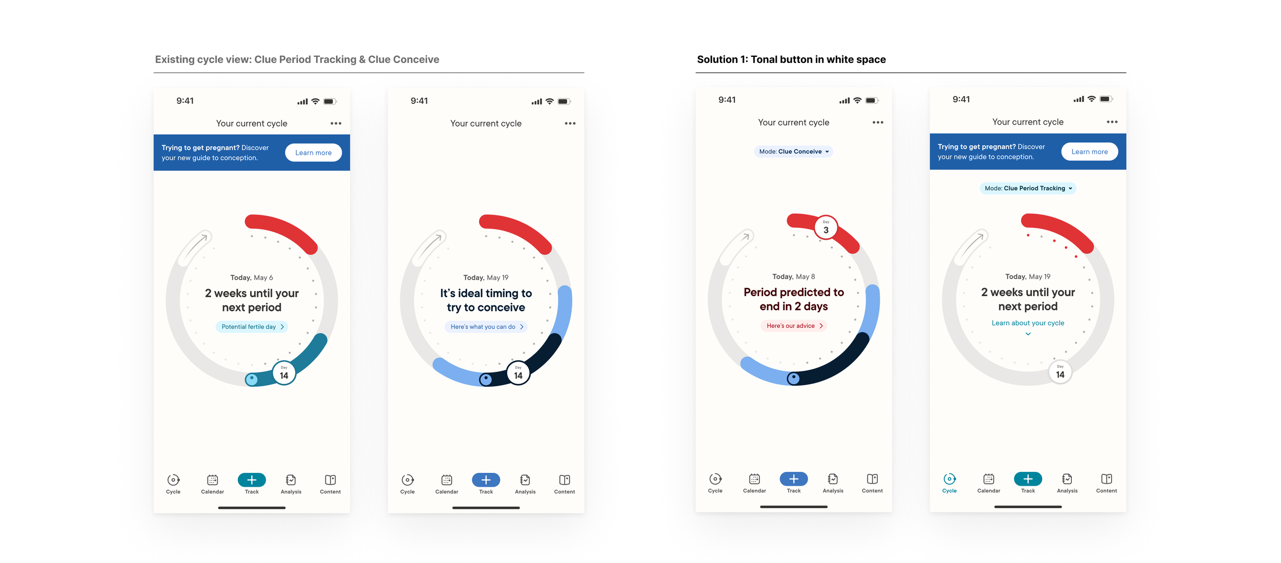
First screens are the existing cycle view in the 2 modes. On the right solution 1.
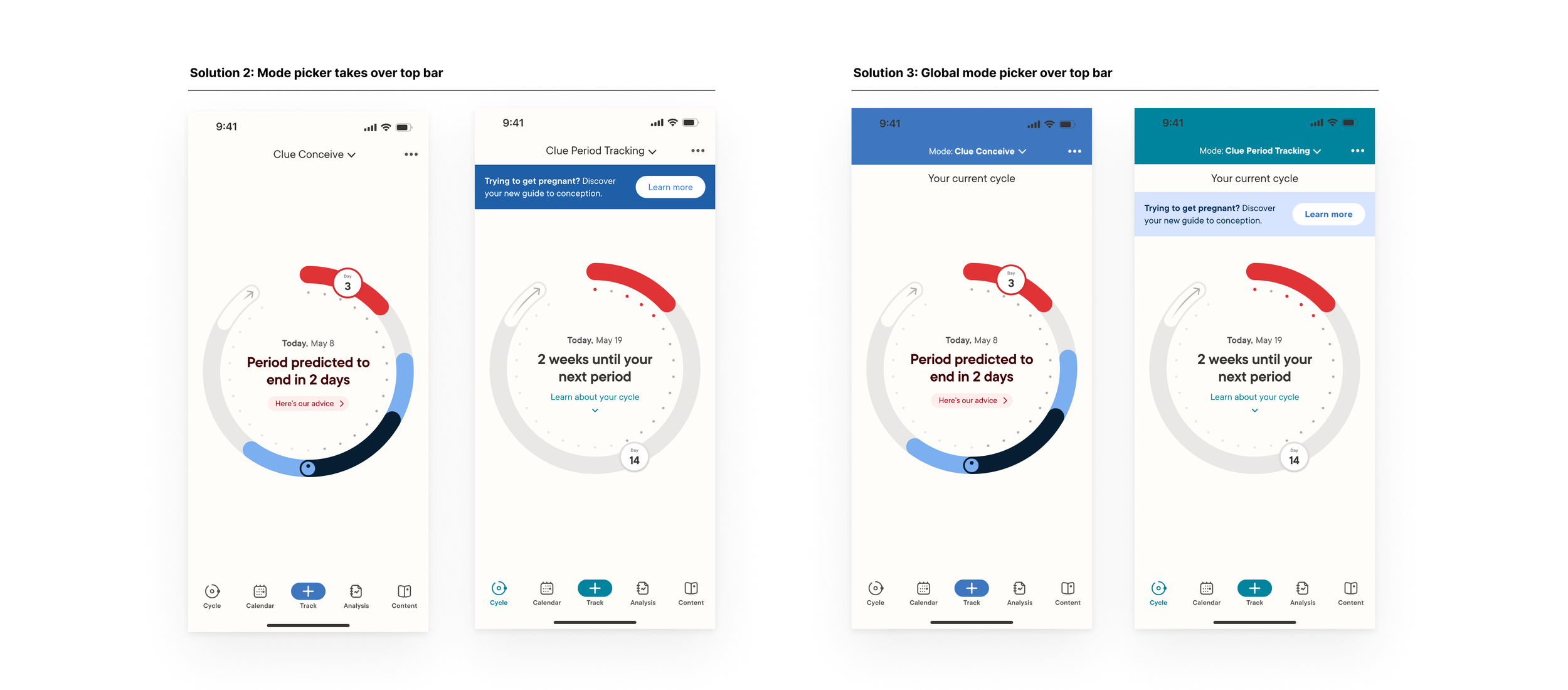
Solutions 2 and 3 are higher in complexity and how much they affect the current architecture of the app.
Usability test
I gathered feedback on these solutions from the design team, engineers and my product manager, and we decided to create prototypes with the mode switching flow and run a usability test. The test was ran with options 1 and 2, because those were the most preferred from both design and engineering points of view.
We were under a time pressure, so I collaborated with UX researcher Alina Efimova to plan and launch an unmoderated usability test with Usertesting. This tool allows us to create a test with clickable prototypes and questions, which the users go through on their own, while a video of their device and their voice is recorded. Afterwards we receive the videos and analyse tests. This is significantly faster than doing a usability moderated live by us. To get the best possible results, we tested with 2 groups: Clue users and non-Clue users. We also divided those into 2 groups, where one had 2 prototypes in reverse order. The interaction flow of the prototypes was the same, but the design of the mode picker changed.
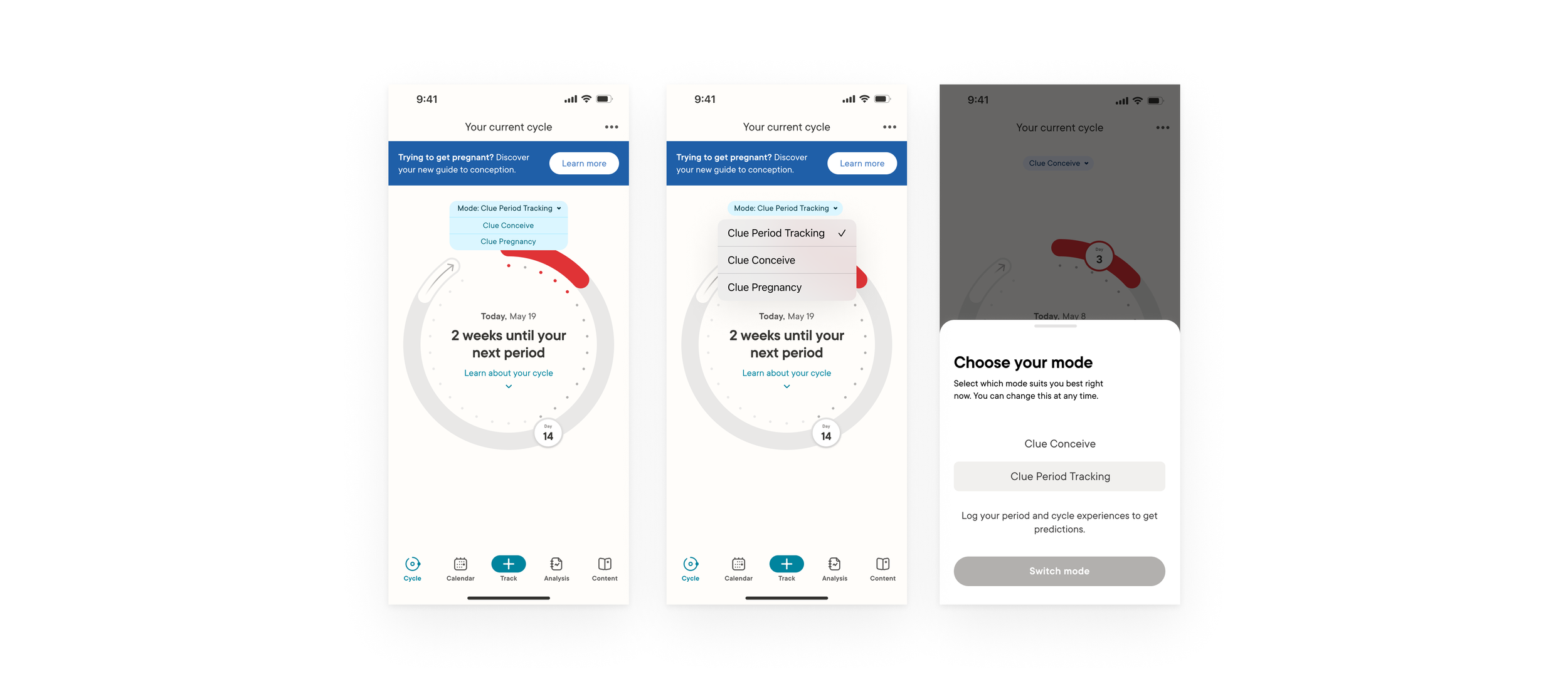
Exploration on the interactivity of the mode picker, from custom drop down, to native dropdown, to a picker sheet. The last one was chosen - it adds more communication possibility on the interaction, and also from a technical perspective the sheet is a more sustainable solution than a dropdown on the same page.
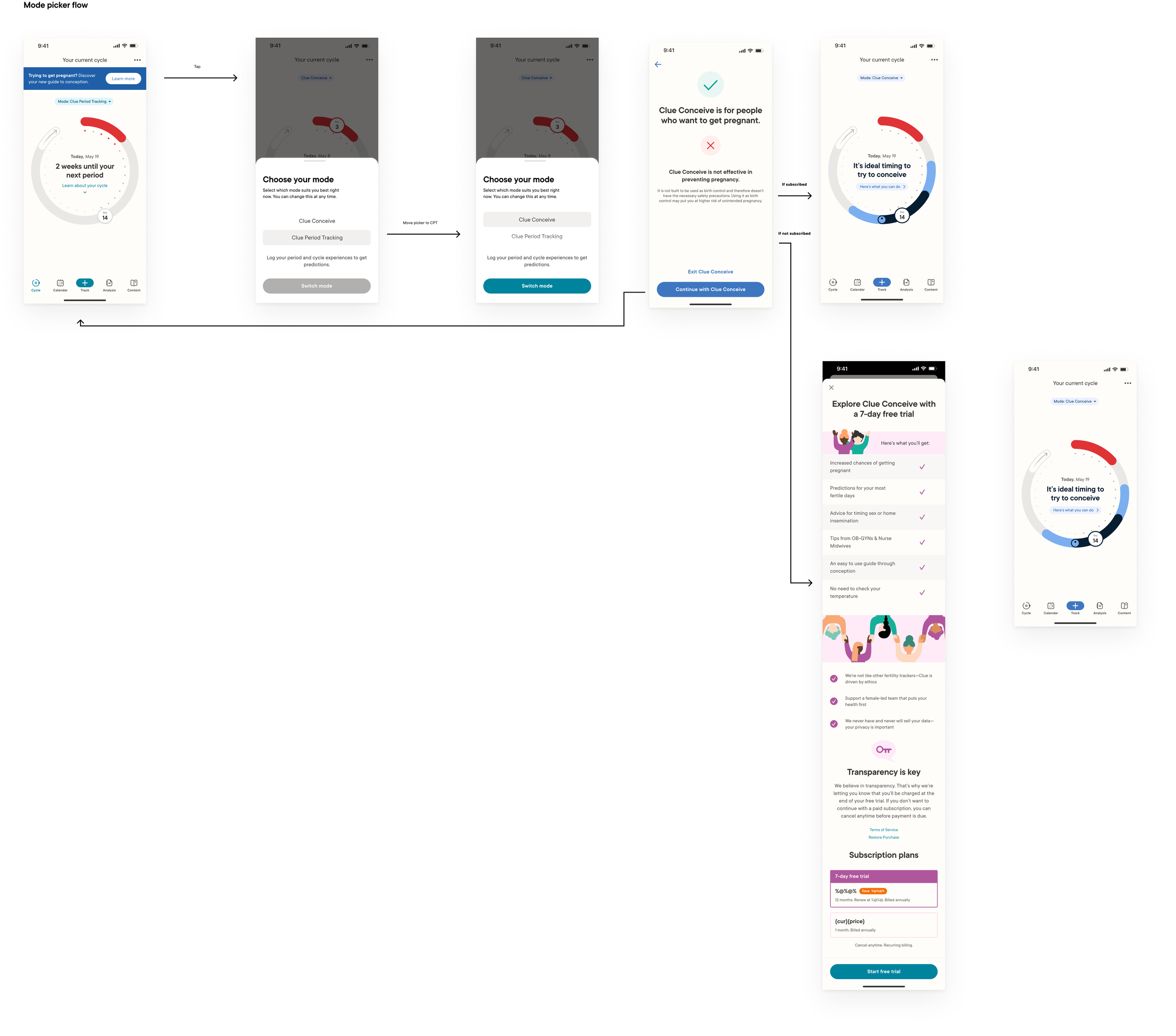
User flow for tested prototype. This was also the final user flow that was implemented.
Screen capture of one of the tested prototypes.
The usability test results showed neither design option caused the users any trouble in switching modes. The switching flow was easy to navigate through. However, users did have a slight preference to option 1 (displayed above in the video and user flow), as option 2 was harder to notice as an interactive element on the screen. With that in mind, and informed but feedback from other team members, option 1 was the one I decided to handoff to engineers to be implemented. A surprise finding in this test was that 4/9 existing Clue users reported they did not know about Conceive mode existing. This was further confirmation that the feature is very needed.
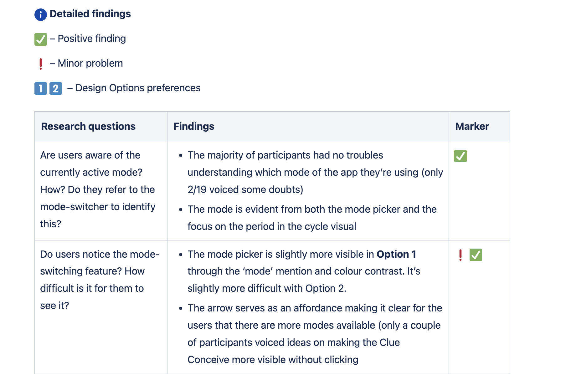
A snipper of documentation from user test analysis in Confluence.
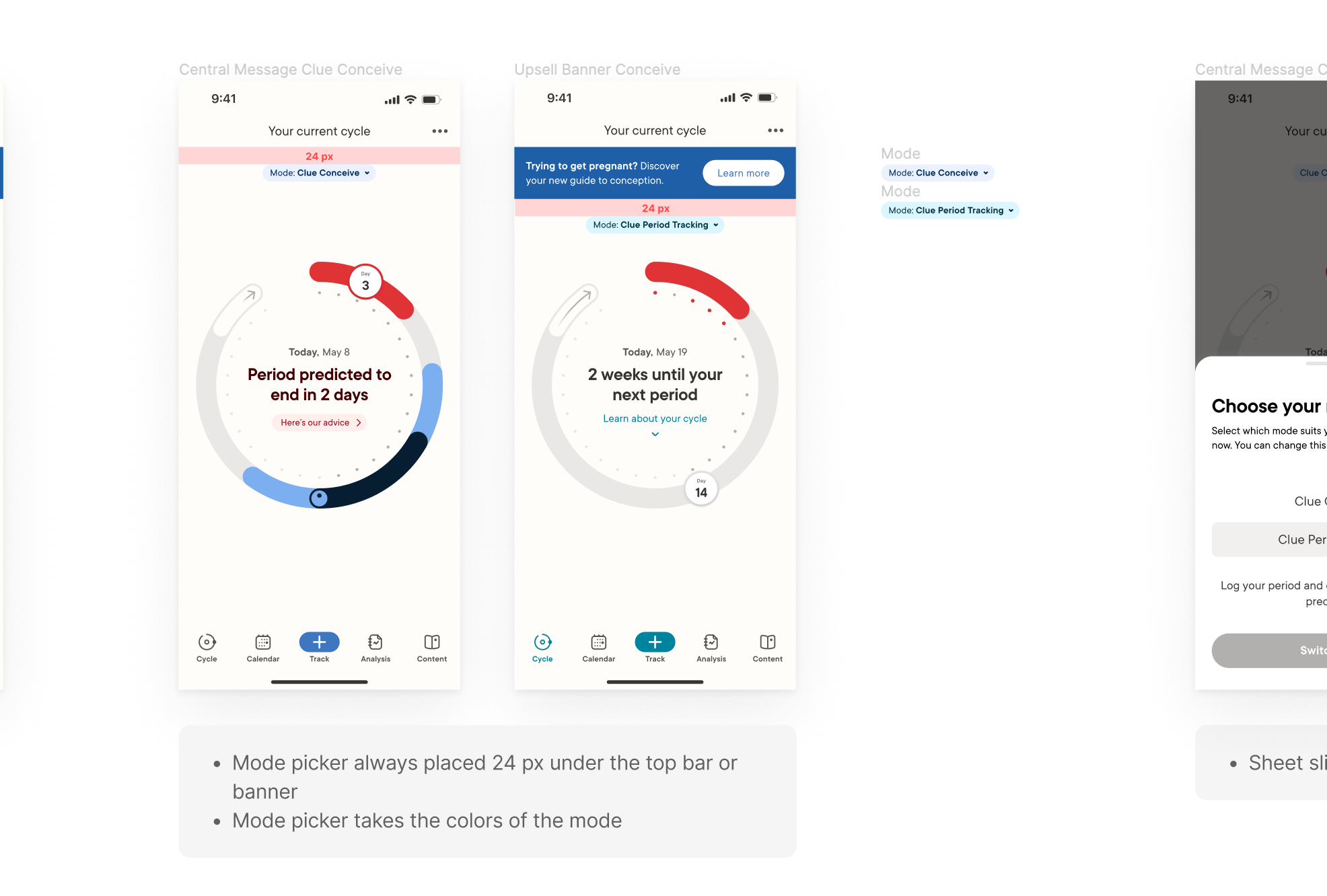
Section of the design handoff to engineering.
Accessibility
During development, it was discovered that the mode picker caused an accessibility issue. For users who have their OS text size set to larger, the cycle view screen became unusable, as the mode picker pushed the cycle down and made it impossible to interact with. We wanted to keep minimum functionality available to these users, so I paired with a developer to find a solution. We decided to add a scroll to the screen which wasn’t previously there. This ensures the screen is usable, albeit not the prettiest.
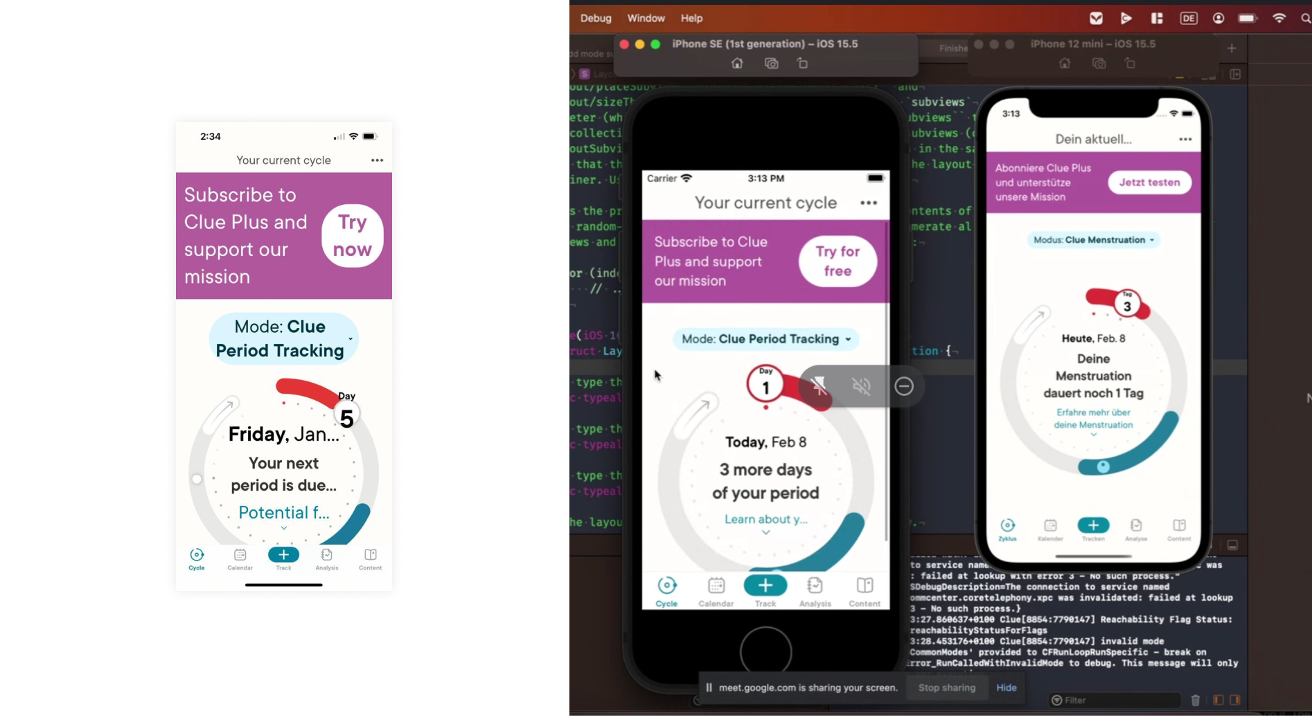
Adding a scroll to ensure minimum usability for users that have set the text as large.
Going forward
The mode picker design was implemented on iOS first, and at the time of writing this, Android was next. The first results of introducing the mode picker here are positive. It generated 14 % of subscriptions in the first weeks, and the views of the pregnancy mode buy screen doubled. Likely this is a peak in the beginning. However, it is expected that over time we could see the feature increasing awareness of modes - our users won’t report not knowing about Clue Conceive or Pregnancy anymore, and the process of switching will be smoother. As for the design team, mode switching globally in the app is still a topic that we would like to create a bigger discovery project around, where the mode could be more tied to user’s profile preferences and be a more global experience of the app.
Quisque iaculis facilisis lacinia. Mauris euismod pellentesque tellus sit amet mollis.