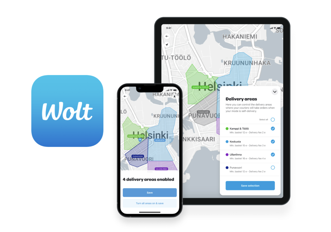
Wolt b2b: flexible delivery areaS
ROLE Senior Product Designer owning the segment
TIMELINE 2023–2024
DOMAIN B2B, food delivery
SCOPE 2 platforms, 3 devices — Merchant Admin (desktop), Merchant App (mobile + tablet)
IMPACT ~17,000 fewer merchant support contacts/year (est.); desktop shipped with strongly positive feedback, mobile/tablet designed and in eng backlog
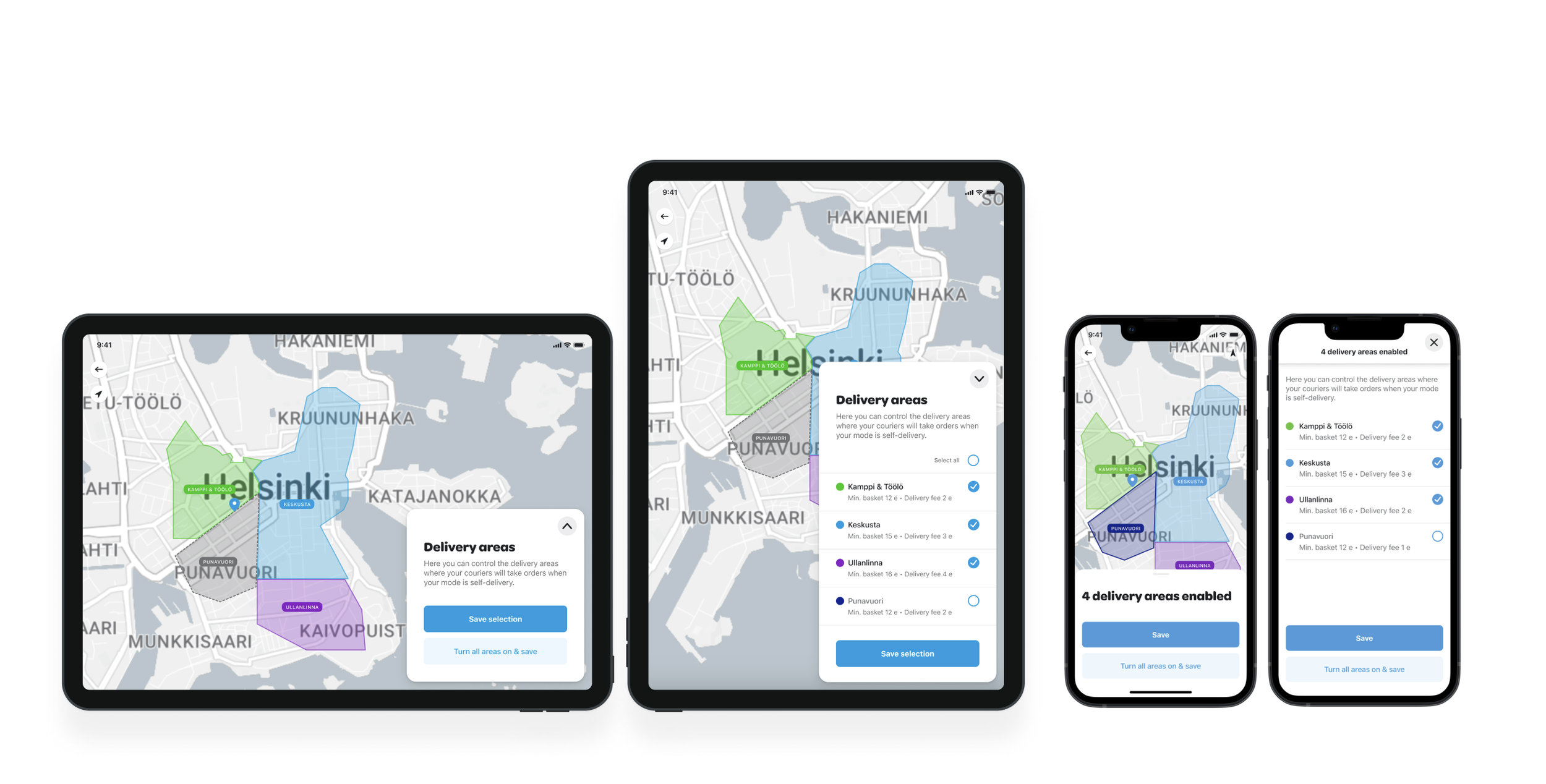
Final UI of Flexible delivery area for tablet and mobile.
Wolt (Doordash International) is a delivery platform and app that operates as 3-sided marketplace: between the local business, the consumer and the courier. I work as a Senior Product Designer in the B2B mission, empowering local restaurants and stores to grow their business through fast deliveries.
I lead design in a part of the B2B mission called Self-delivery. This meant my team created solutions for restaurants and stores that employ their own couriers. We built tools for these merchants to grow their business and manage their operations in the day-to-day. My role in this project was to lead the design work, collaborate with sales and product to create hypothesis, and to ensure quality of design & interactions.
Defining the USER NEED & HYPOTHESIS
The main problem we started to work on was a business problem. Our internal Wolt sales and operations teams spent lots of time answering phone calls and changing the delivery settings for merchants. If delivery settings aren’t as they wish, sometimes the merchant chooses to close the Wolt app and we lose the business. As the Self-delivery business was growing, it became clear we need to build more self-service tools to empower the merchants to use flexible settings themself and reduce the tasks of operations. We created user needs and hypothesis.
High level user need:
“As a merchant, I need flexible and easy tools to handle the day-to-day operations in the restaurant and with my couriers.”
Feature hypothesis:
”If we bring the opportunity for restaurant managers and staff to toggle delivery areas on and off based on how busy they are and how many couriers they have, they can maximise their operations and don’t have to turn off Wolt entirely when busy or understaffed.”
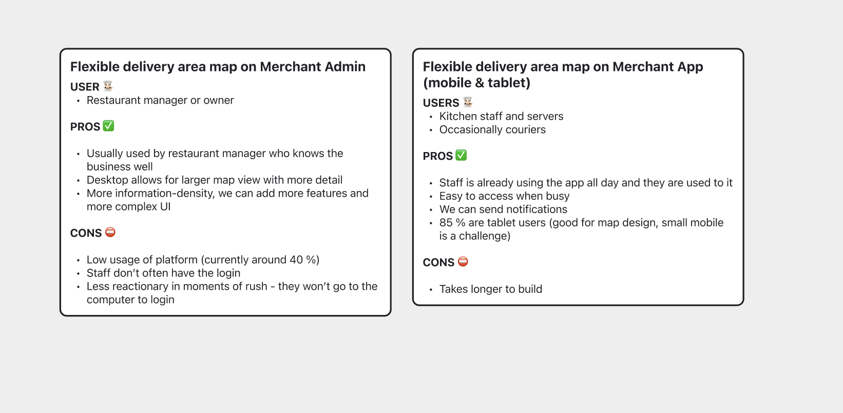
Notes from prioritisation documentation: the feature can exist in both platforms and be used by different user groups.
IMPACT & Prioritisation
The estimated impact of this feature is 17 000 less contacts to country teams per year, significantly reducing the workload and eventually headcount needed. This is a major business opportunity that was prioritized over other initiatives.
The team decided to first build the feature on the desktop platform called Merchant Admin to test and gather feedback, before going through the more time-consuming and costly route of building the feature into native Merchant Apps on mobile and tablet. Eventually I designed versions for all 3, with different use cases in mind and the mobile versions were added to native engineer’s backlogs.
UX & UI Design For desktop
The desktop platform is called Merchant Admin, and as the name suggests, it hosts many features from changing menu items and opening hours, to data visualisation of sales. We built the flexible delivery area map within the restaurant details -page, which also hosts other related settings.
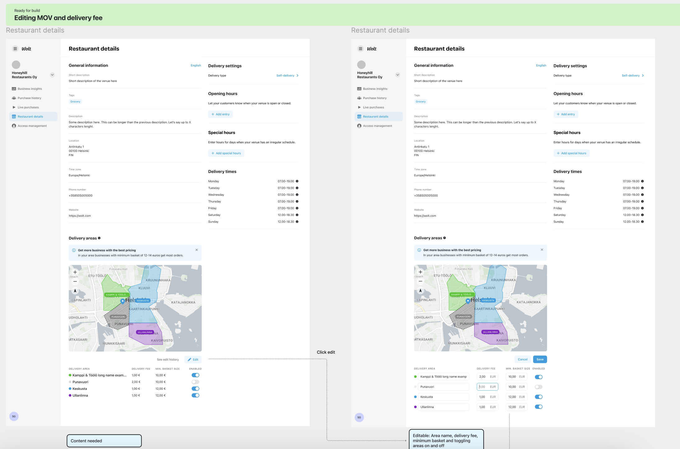
Part of design handoff of desktop version. On desktop, the users can also change pricing of areas.
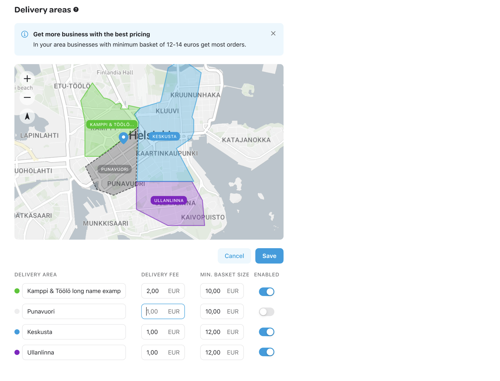
Detail of the UI on desktop: map, settings and insight component to guide users to make good pricing decisions.
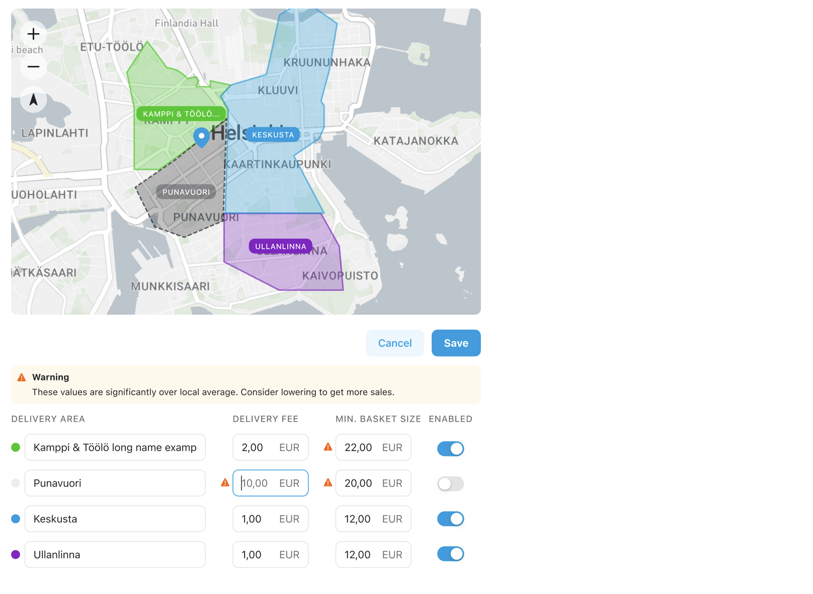
Detail of warning states guiding the user to make better business decisions.
Gathering feedback
We released the feature in limited areas to start with, and stayed in contact with support agents and sales that gathered feedback from users. The feature was very well received, feedback was overwlehmingly positive. The users appreciated the fast toggling of areas with an overview on the map.
UX & UI design for mobile devices
The next step was building the feature on the Merchant App. This app is the one the restaurant staff uses to accept deliveries, so they use it heavily every day. They already can use the app to turn off specific menu items and close deliveries momentarily - so using the same app to toggle delivery areas on and off could offer another flexibility to react during peak hours. This means delivering further away when there are less orders, and only short distances during peak hours to maximise sales. Even though the app is a B2B product, the design needs to be consumer-grade: simple, fast and intuitive.
User need:
“As restaurant staff, we have very busy peak hours and low hours with less traffic, so we need the Wolt app to offer flexibility to maximise sales with our operational capacity in the moment”
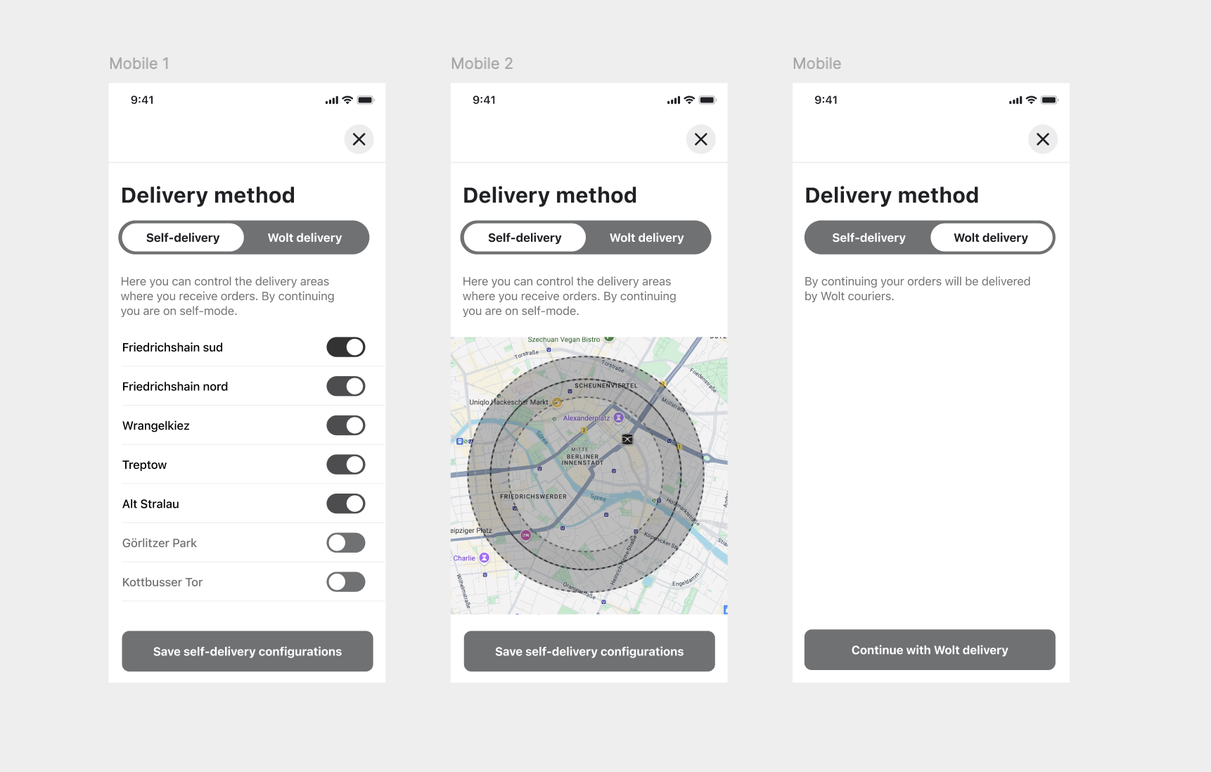
Scrapped exploration. The design process started by creating low-fidelity wireframes in a design jam together with another designer, Yali. These wireframes are an exploration of combining the map with choosing the delivery mode: an idea which was discarded as it combined too many tasks and usability was compromised.
Prototype for mobile, exploring 2 different UI options. I used this prototype to present the feature options to stakeholders ranging from engineers to leadership. The prototype served as a tool for prioritisation and estimation: the version with map was prioritised for usability reasons.
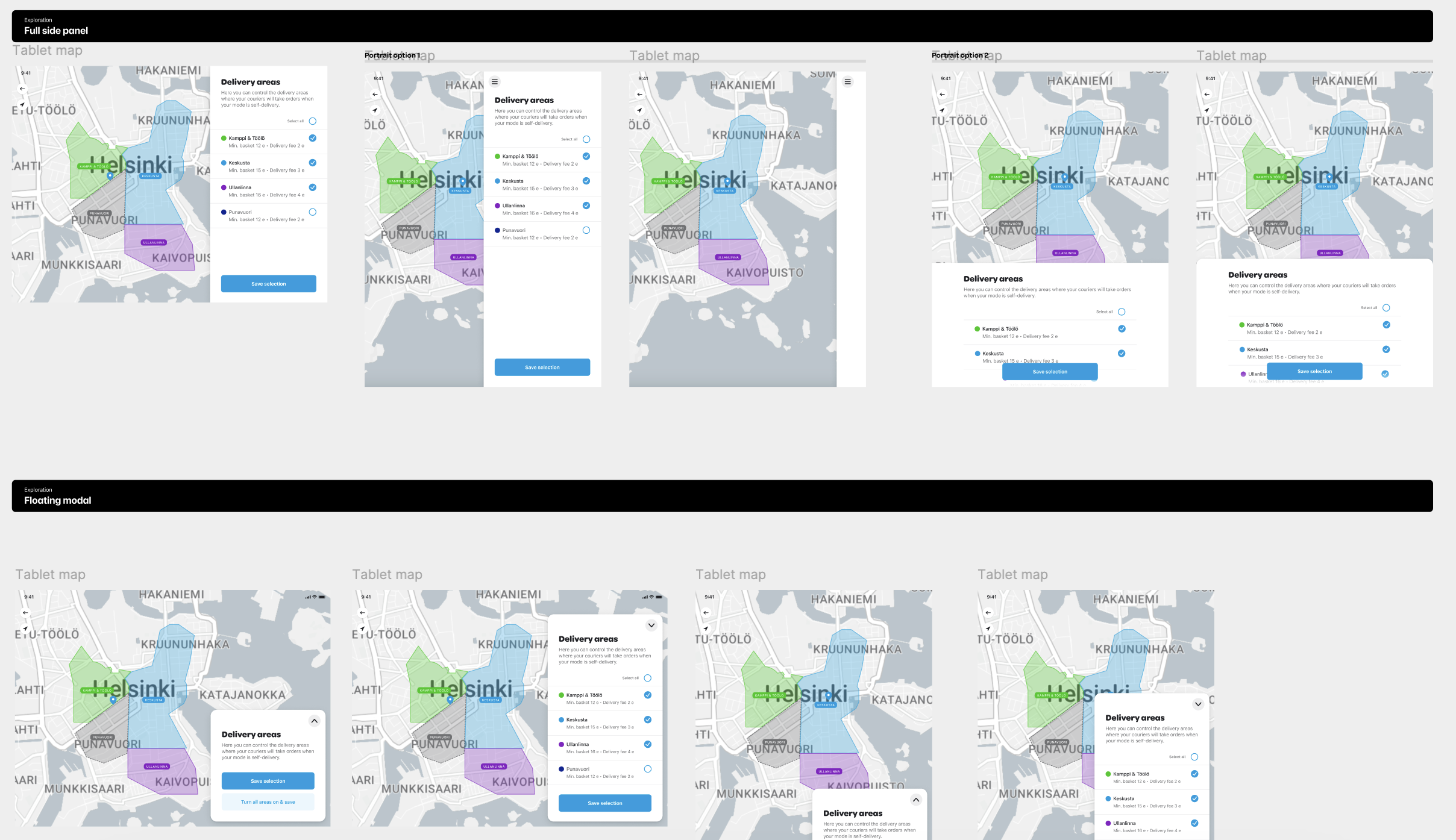
UI explorations for tablet on portrait and landscape. At the time of design, tablet usage was around 40 % but was forecast to go up to 85 % when tablet users that were still on a legacy version were updated. The design with a floating UI allows for most map real estate and thus was chosen.
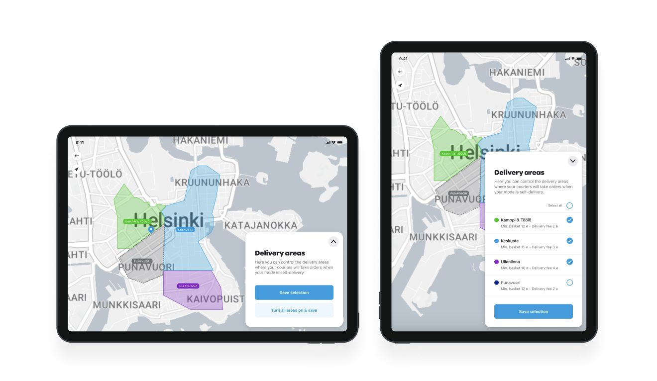
Final tablet designs. The user can tap either the area on the map, or the name on the menu to toggle it on and off. For quick usage in a rush hour, the menu does not need to be extended to make fast adjustments, however it is there to provide more information when needed.
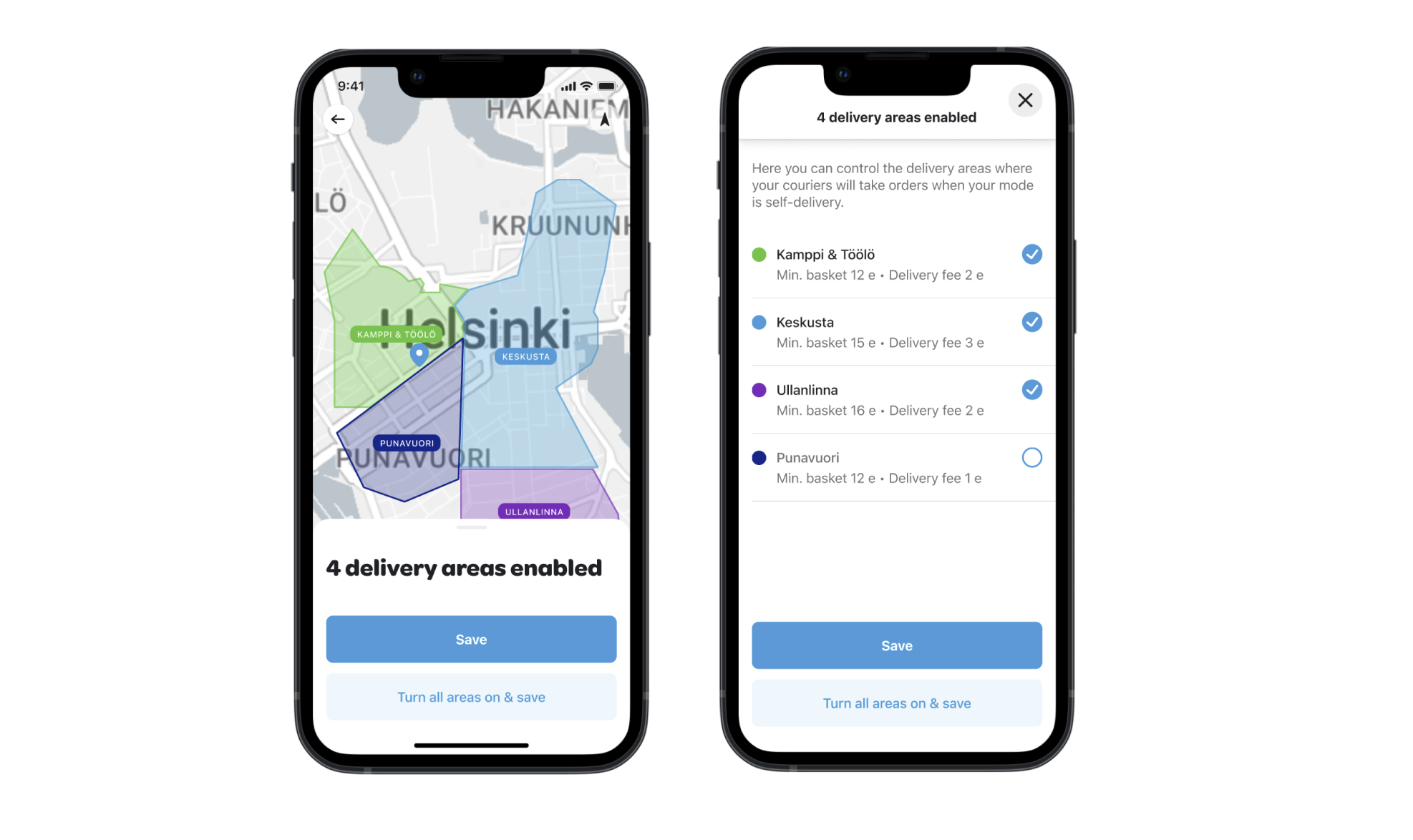
Final UI for mobile. Users can tap on areas on the map to toggle them on and off, or swipe up to open the full list to see more context. The quick action of switching all areas on with a single tap is always available for fast access.
Going forward
At the time of writing this, the desktop feature was implemented and published for a limited user set. This is to monitor any possible issues caused by merchants making changes themself. In the first months after the launch, the feedback has been only positive and further launches are planned. Going forward, we want to monitor the percentage of merchants actively using the feature over time and impact on retention and satisfaction through surveys. As for mobile versions, the designs are ready and engineering work has been estimated but due to limited resources, it is in backlog waiting to be prioritised.
Quisque iaculis facilisis lacinia. Mauris euismod pellentesque tellus sit amet mollis.