Oviva Acquisition: from one funnel to a personalized system
ROLE Senior Product Designer owning acquisition
TIMELINE February 2025 – June 2026
DOMAIN Health tech, growth
SCOPE Web-based acquisition surfaces for 2 products and multiple lead segments. 85 % mobile. AI-enhanced process.
IMPACT +16 % uplift in conversions, -48 % cost per lead
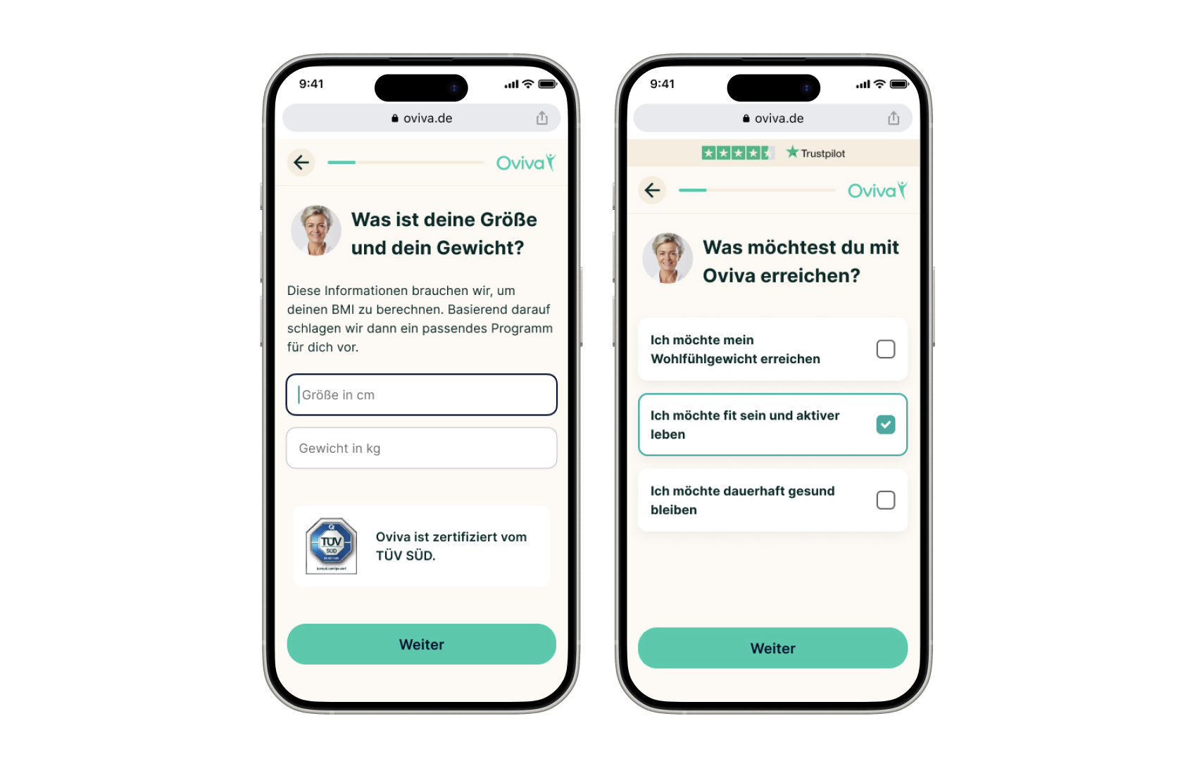
Some of the latest rebranded UIs in production.
Oviva is a program for weight-related conditions, and the most prescribed healthcare app (DiGA) in Germany. Over the course of a year+, I lead design in the continuous improvement of the acquisition funnel.
the starting point
In the beginning of 2025 there was one funnel, and everyone went through it. I was hired as the first designer in the team to improve acquisition. What started here, was more than a year of continuous experimentation and several concepts: spanning from UI rebrand, to lengthening the funnel with emotional questions, to creating dynamic content for specific segments and separating the funnel into multiple experiences from different lead sources.
Business need:
”Our acquisition funnel is visually outdated and too generic. We need to increase conversions by identifying the highest-impact improvements and test the impact rigorously. “
One of several feature hypothesis:
”If we ask the users more personal questions about where they are in their weightloss journey, and answer each empathetically, the users will feel heard and understood which makes them more likely to convert. “
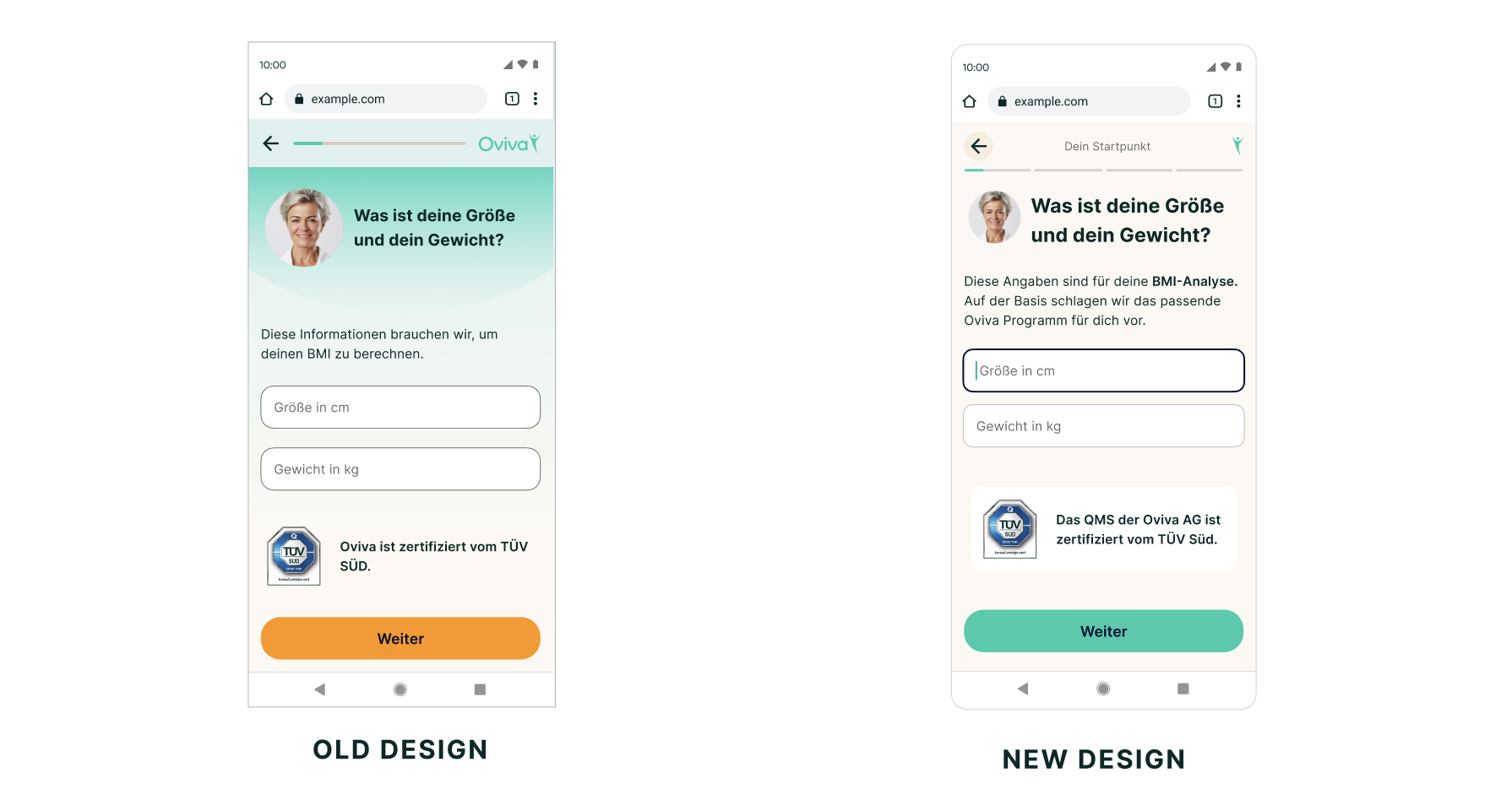
Th re-brand was a visual refresh of the UI to be aligned with current brand assets, but entailed also UX and hierarchy improvements.
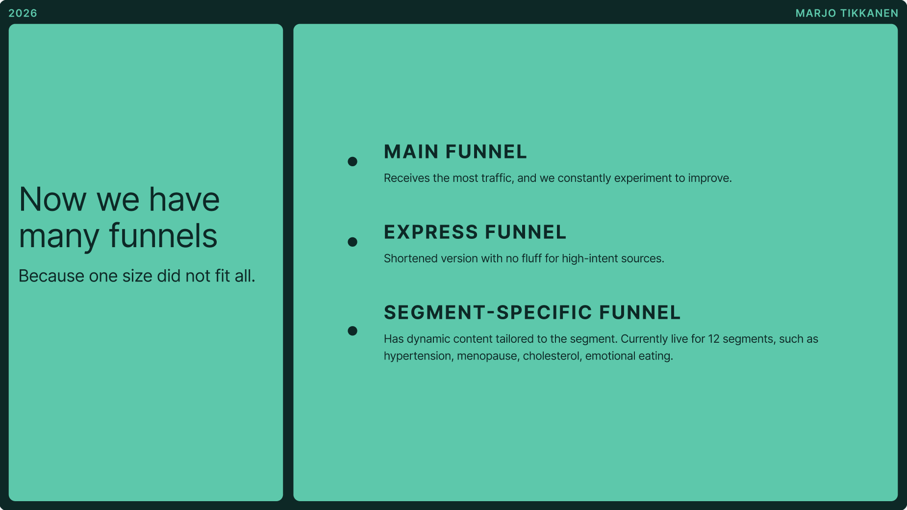
Slide from presentation describing how we went from one funnel to many.
personalization concept
One of the largest experiments was a concept we called personalization. The concept was based on insights found in a round of interviews where users clicked through the existing funnel and talked about how the messaging and visuals made them feel about signing up.
Insight:
”The users do not doubt whether Oviva works as a program. They doubt whether they can stick to it, because they have failed before, because they have busy lives, illnesses, families, or other hindering factors.“
This insight made it clear: we need to design the funnel to feel less like a clinical intake form, and more like a personalized experience, where we listen and validate, making the user feel like there is nothing wrong with them and that we have supported many people like them in their weightloss journey before.
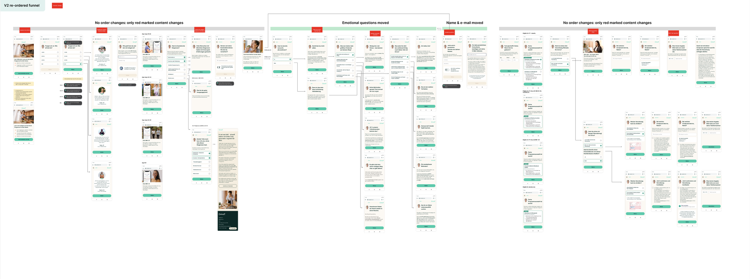
Workspace where I experimented with re-ordering questions and dynamic content.
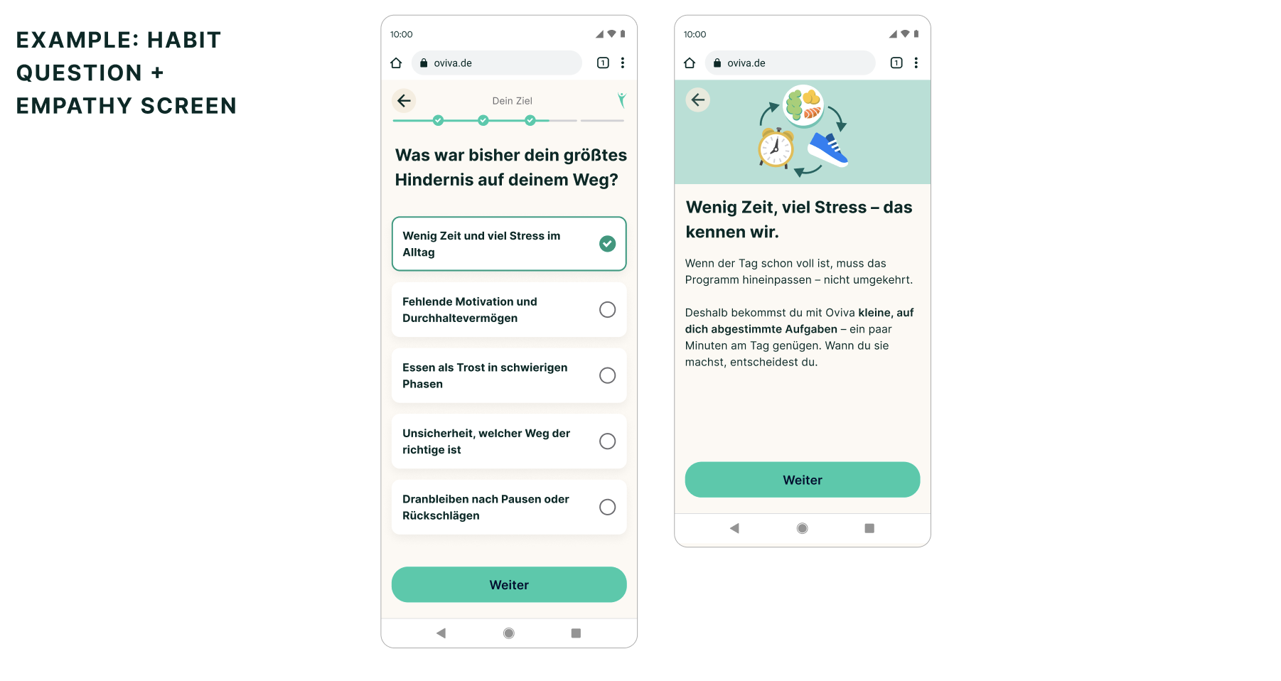
UI example with segmented progress bar and illustration.
user testing & Ai prototyping
We were working with tight deadlines, but I wanted to run user testing to see if we are going in the right direction. I explored AI tools to create a realistic prototype, and after testing a few options, found that Figma Make was the fastest way to get a result close to production quality. The prototype was very close to final UI, interactions and validations. The test ran with 5 participants and 4/5 was positive feedback on the concept, so we were on track to release the experiment.
impact
The personalization concept went from 18 screens to 25 screens - a big increase, but it was worth it: the experiment created a 16 % relative uplift in conversions. We ran a few AB tests with some UI tweaks to the concept too: with/without the doctor character, with different progress bar designs and with illustrations on some of the more text-heavy screens. Each time the winner was what remained in production.
Screen recording of the funnel in production on mobile.
Interaction design
The funnel was not only visually outdated, but there hadn’t been focus on interactions or flow of the experience. Several experiments included improvements on the interactions to drive better results through engaging user experience. These improvements were incremental over many AB tests. The interaction improvements included: a toast component to give immediate feedback on critical points, quick insurance picker, animated loading screen and an improved search for doctor details.
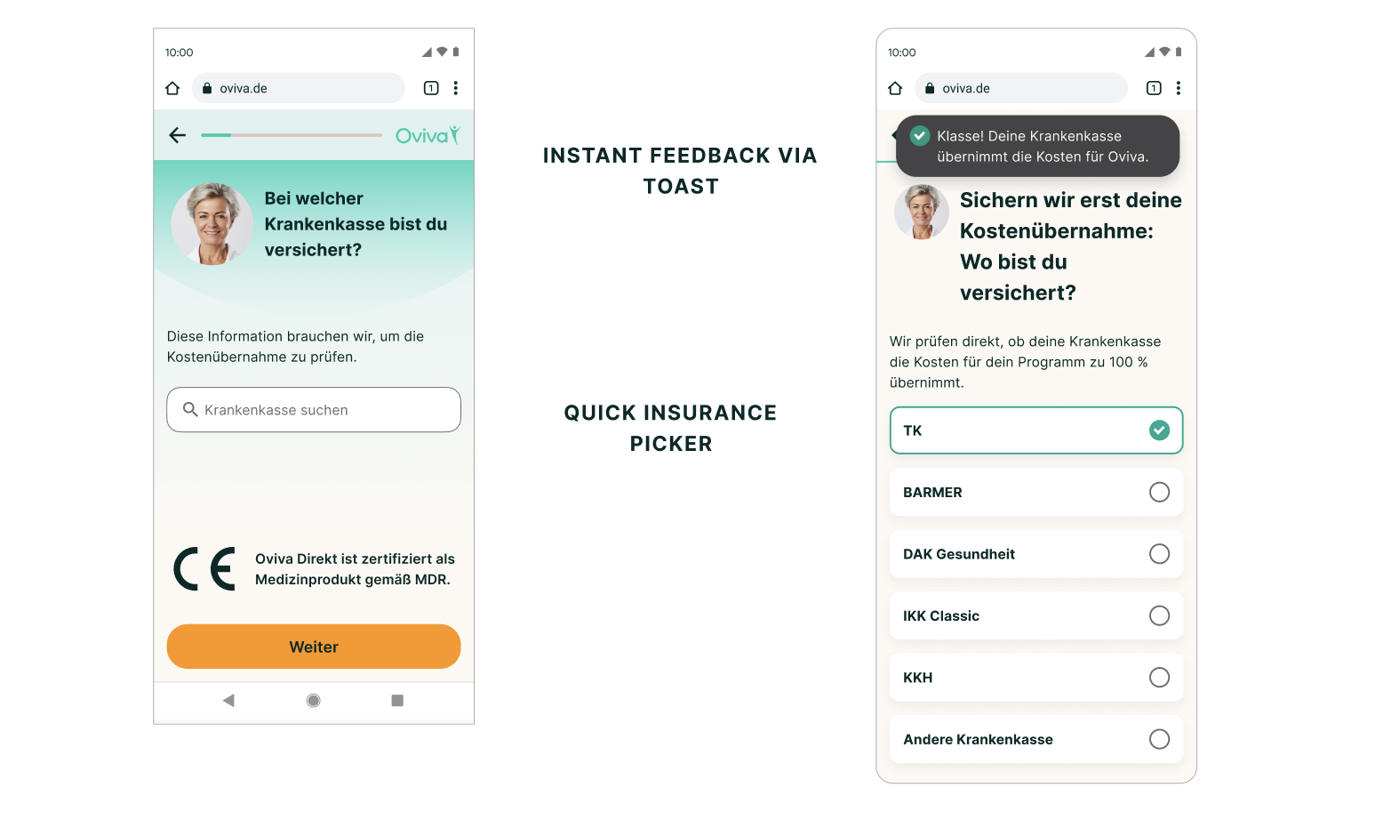
Re-design process of one critical screen: insurance picker. Instead of a very long scroll, I found that around 80% of users are with the 5 most common insurances, so surfacing them makes the screen much faster to navigate for most. The toast as immediate feedback that your insurance covers Oviva, creates an a-ha moment to keep the user engaged even if the form is long.
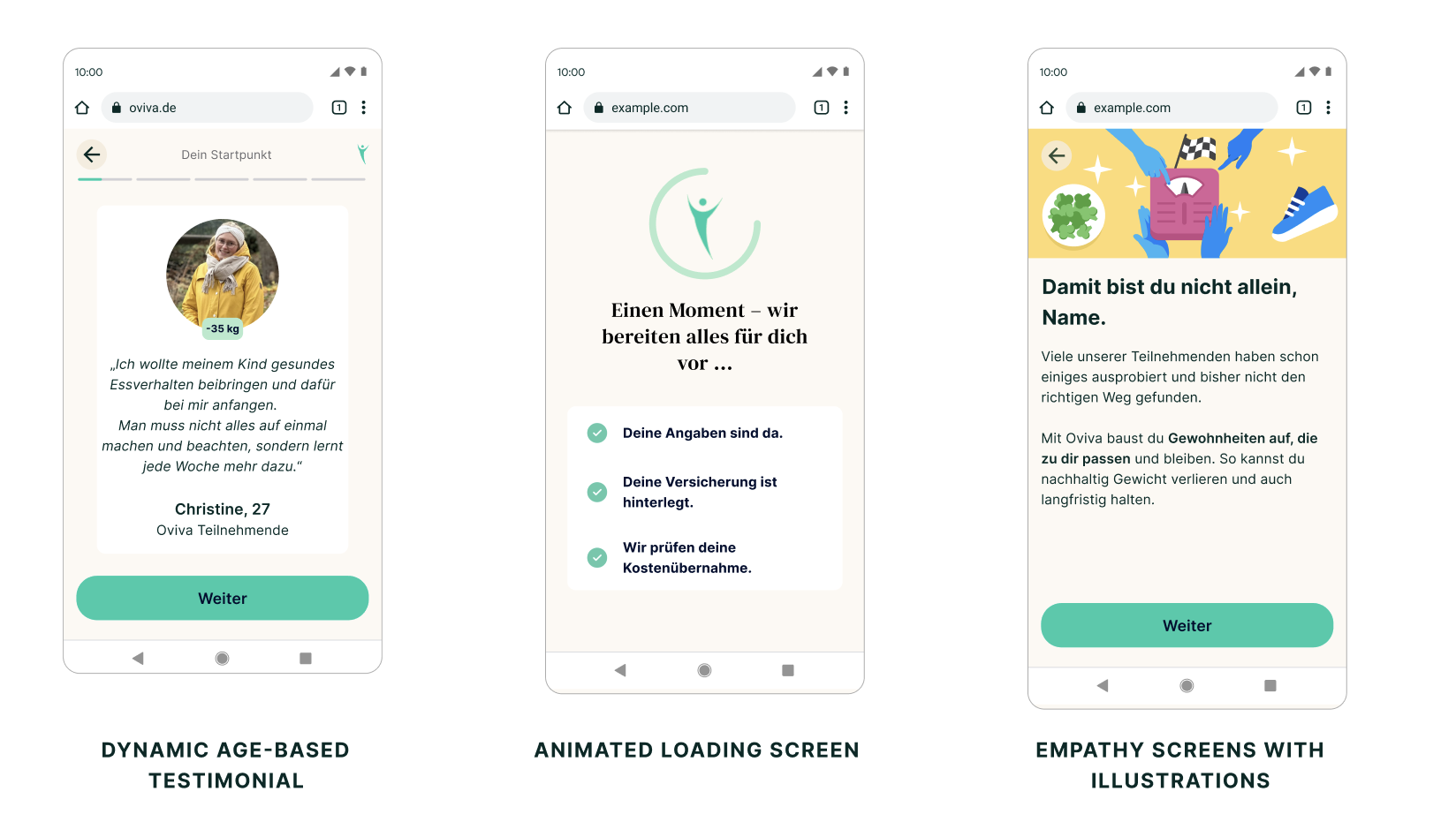
New UI elements I designed to run experiments with.
Express funnel
The personalization concept created an uplift in general, but not across all sources. The step-level dashboard data showed us that users from different sources (meta ads, app downloads, brand searches) behaved differently and had different drop off points. So we started to divide the traffic and experiment with different sources - and tested the opposite concept: we called it the “express funnel”. This funnel is much shorter, faster to fill, has cleaner UI and has less marketing content.
The express funnel was launched for high intent sources, namely app traffic and brand search, that were not converting at the rate as meta traffic. It performed at baseline: the hypothesis that these users would convert better on a shorter, stripped-back funnel didn't hold. What it did establish was that we could run structurally different funnels per source without degrading either, which is what made the segment-specific work possible and opened a door for a whole system of funnels.
Segment-specific funnel
This concept was born from marketing data. I collaborated closely with our growth marketing team, learning from their results weekly. They saw that ads and dynamic landing pages that were personalized for specific segments were creating lots of clicks, but big drop off in the funnel. So I took over to design a version of the funnel with dynamic content for the segment.
The challenge was again the need to move fast, so a lean concept to validate the solution was the way to go. I designed a minimal version of dynamic content blocks together with the content writer. This needed to be flexible enough to serve many different segments, like age groups, illnesses and lifestyle groups.
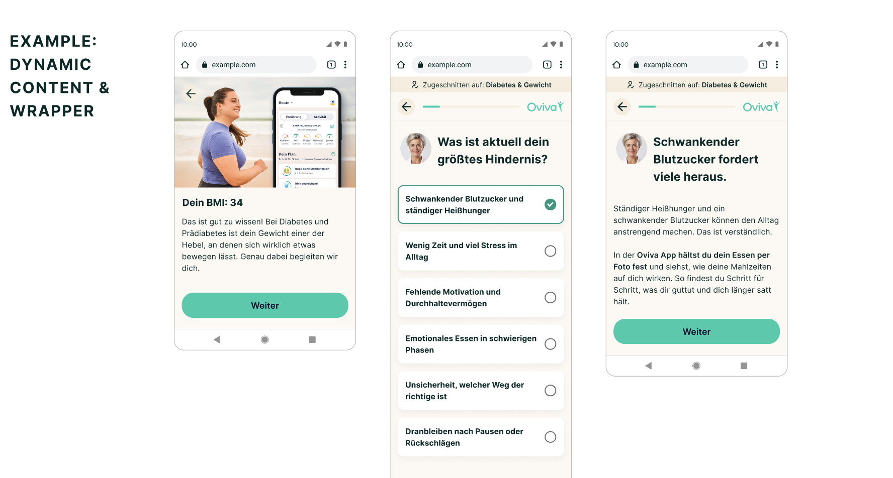
Screens with dynamic content for diabetes segment
Impact
The segmented funnel created a 48 % reduction in cost per lead, making it a very successful experiment. The lead numbers were not high, but with this reduction in cost, and with lean AI-supported process, we could launch new segments efficiently to create revenue. This was reach to new user groups that previously were not signing up for Oviva.
Quisque iaculis facilisis lacinia. Mauris euismod pellentesque tellus sit amet mollis.